First-Time User Experience Design
PAW Patrol: The Game
Game Designer & Producer, Originator
Timeline: Designed pre-launch, validated at soft launch (Mexico and Australia, September/October 2025), holding at global launch (July 7, 2026)
Platform: iOS/Android tablet
Audience: Primary: preschool-aged children (ages 2 to 5), non-reading. Secondary: parents, potential co-players/payers.
Note: the screens shown in this case study are a Figma recreation of the shipped design, rebuilt at higher fidelity than the original production mockups so the interaction details are easier to walk through. The underlying design decisions, copy, and flow are unchanged from what shipped.
Summary
- Designed the onboarding for a preschool game so a non-reading 2-5 year old could be guided into the game's world through audio, animation, and staged camera framing alone.
- Testing surfaced two points of friction before launch: players never discovering the game's other activities, and accidental exits from the level.
- Both were resolved before ship: player choice at the main menu instead of a forced funnel, and a deliberate double-tap exit.
- The FTUE hit a 97% completion rate against a 60% soft-launch target, and has held at 94.7% completion since the game's global launch.
Key Moments
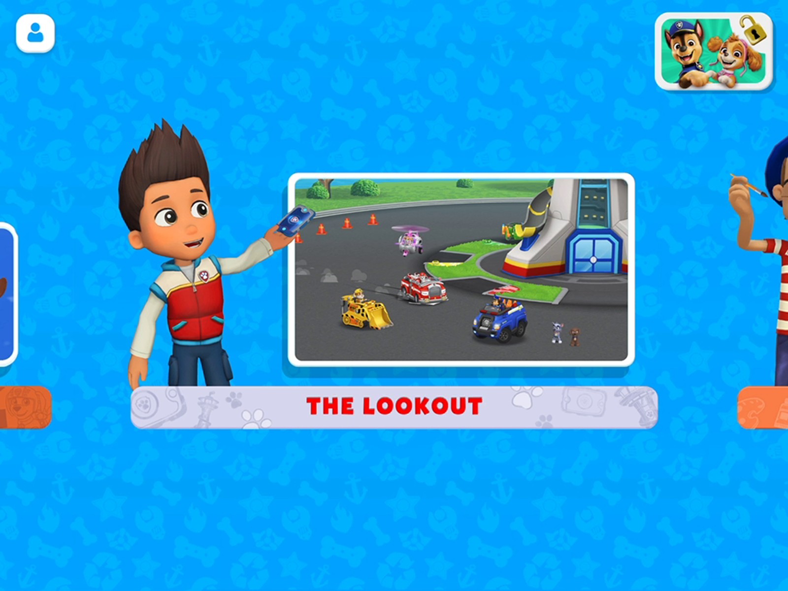
Main menu: the Lookout is optional now, not forced.
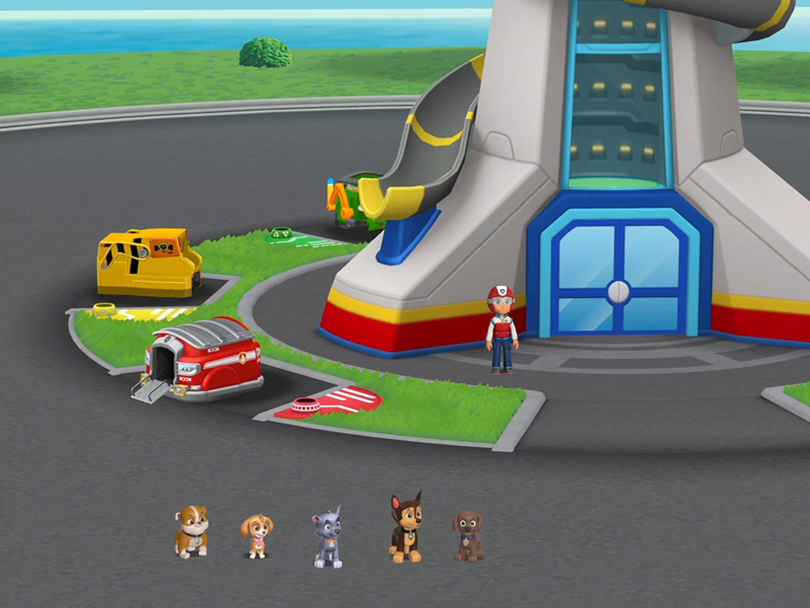
Ryder waits at the Lookout. One pup is missing: Marshall.
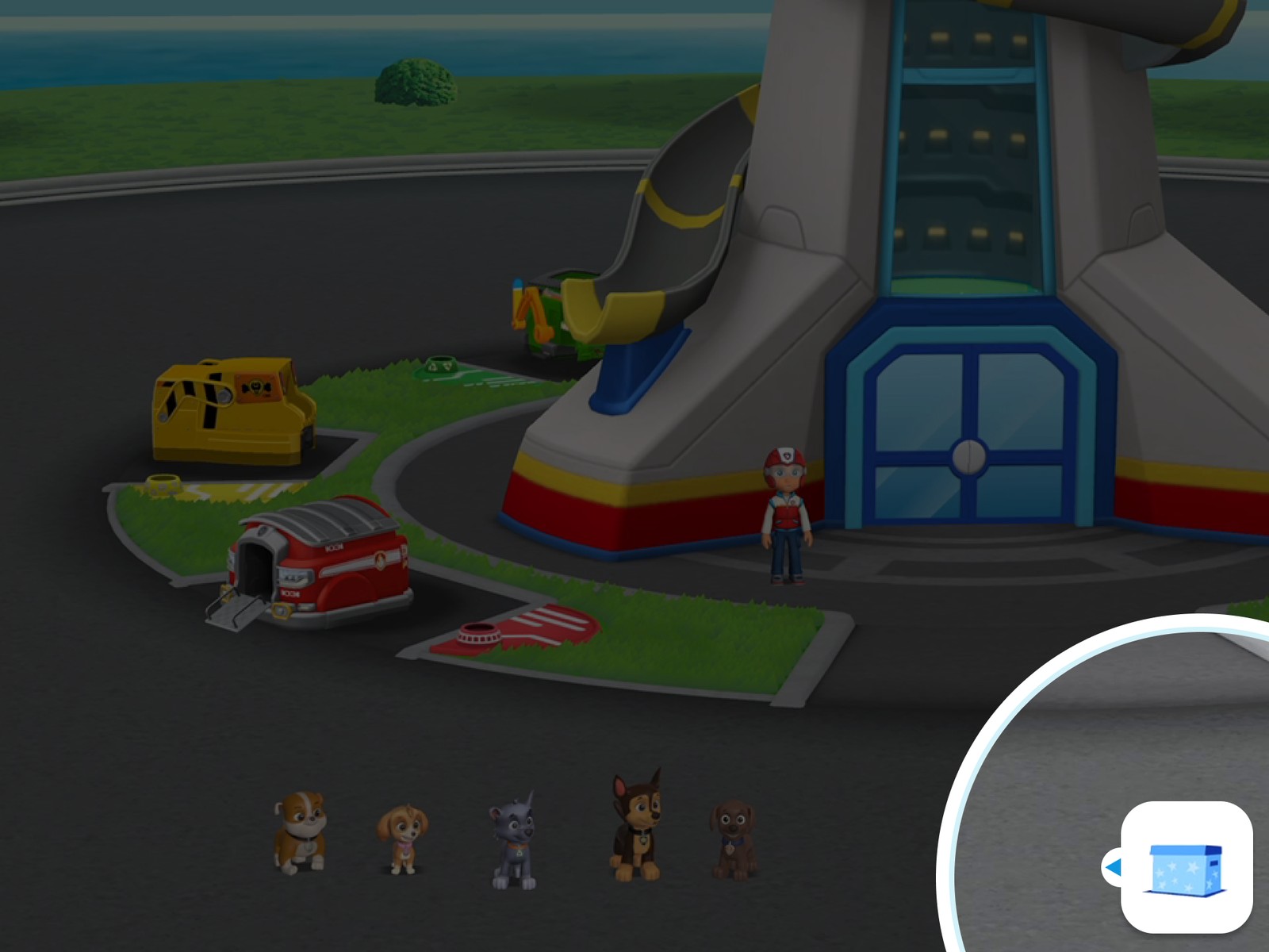
A dimmed spotlight draws attention to the inventory icon.
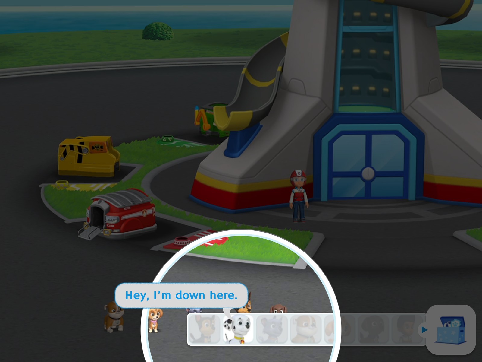
The reticle shifts to spotlight Marshall specifically.
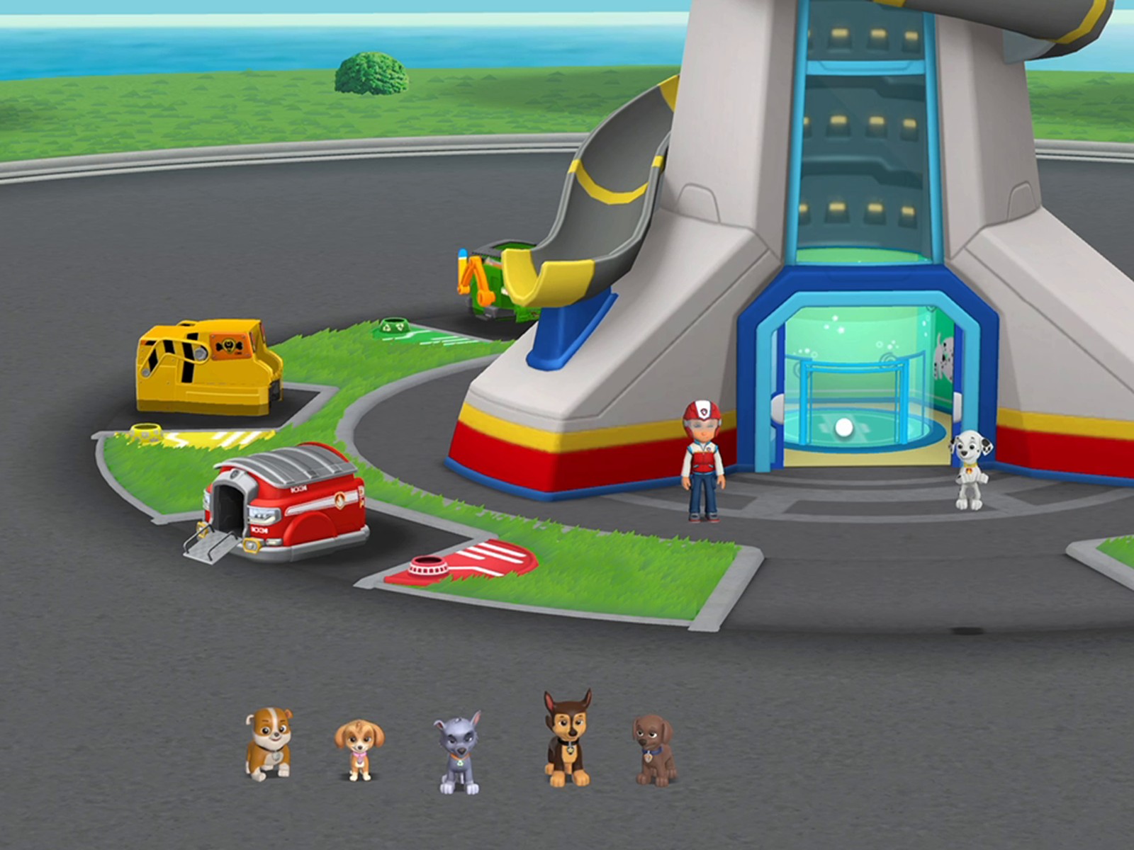
Marshall rejoins the group as the elevator opens.
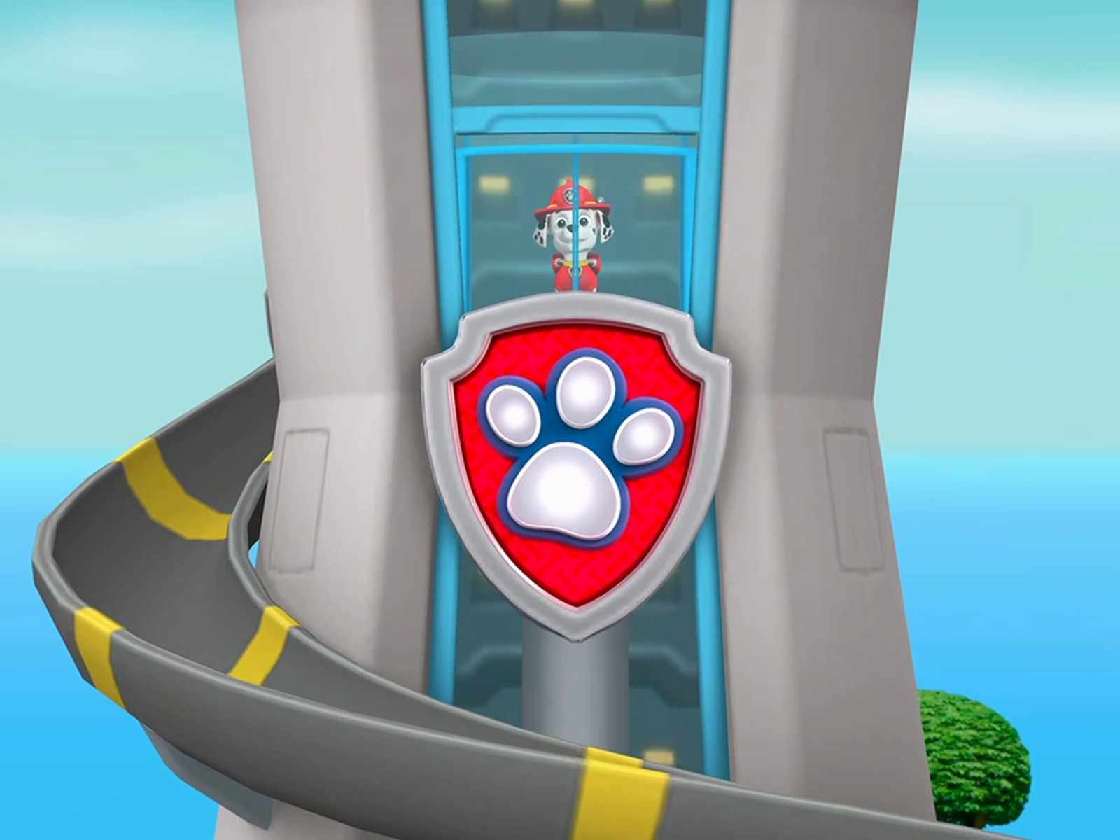
Riding up through the tower, mid-transformation.
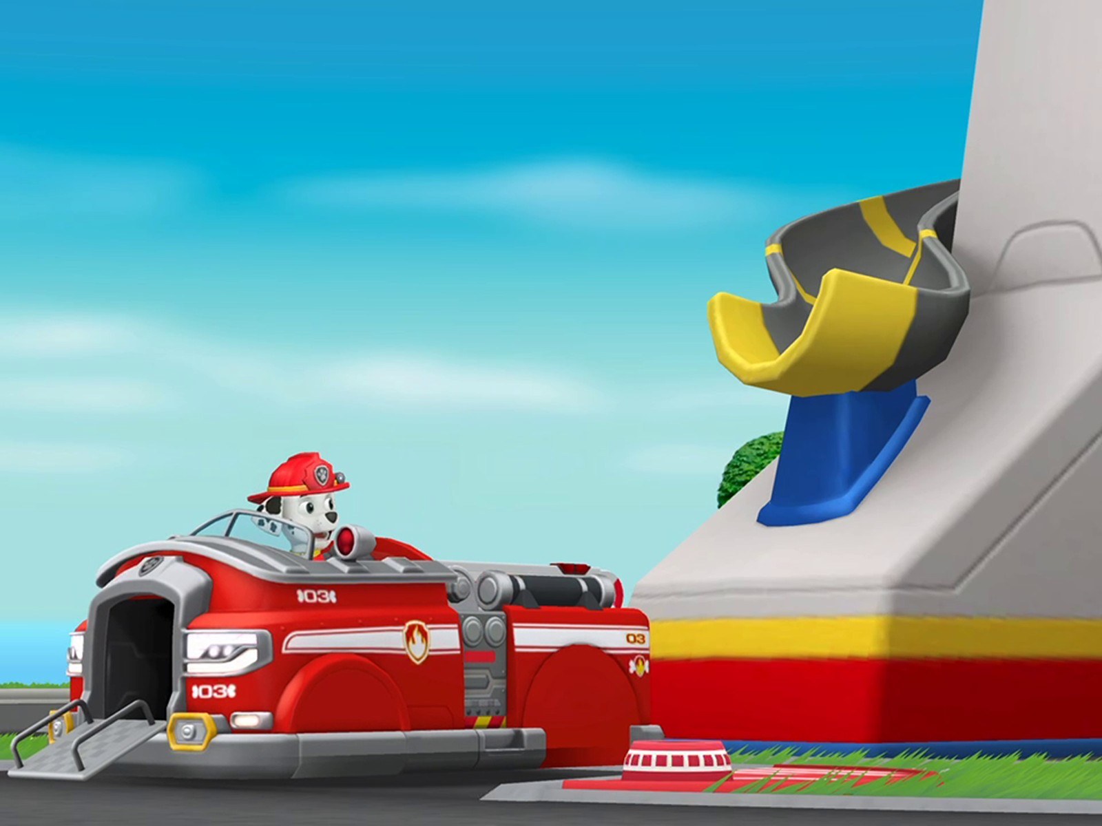
Vehicle transform complete at the base of the slide.
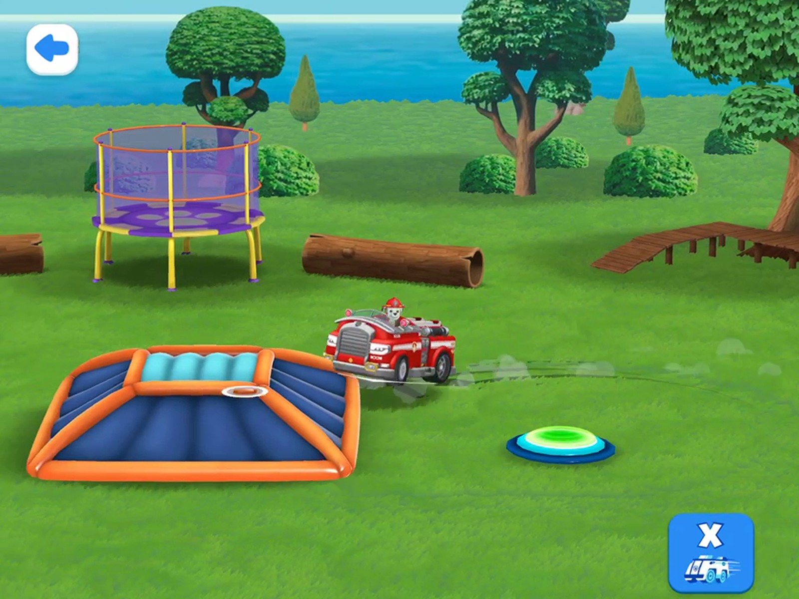
Free driving: control returns to the player.
Skip to the full interactive Figma prototype and shipped-game comparison »
Problem & Opportunity
Going into soft launch, our internal success bar for FTUE completion was 60%, a reasonable target for any tutorial sequence aimed at very young children, who are inconsistent about finishing anything on the first try. Two design problems stood in the way of even hitting that bar, and both came from the same root cause: designing for an audience that can't read instructions, so every cue has to be conveyed through motion, sound, and staging instead.
Discoverability. An early build dropped players directly from the splash screen into the Lookout, one of the game's free playsets, skipping the main menu (the game's actual activity picker) entirely. It got players into the tutorial faster, but it meant they never saw that other activities existed. Starting everyone in a single forced playset undercut the rest of the product before they'd even seen it.
Accidental exits. The level's exit button originally responded to a single tap. In testing, we saw this trigger constantly, not from kids deliberately quitting, but from how young children actually hold tablets: grips at the top-left and bottom-right corners, thumbs and palms resting where a traditional adult grip wouldn't, plus a lot of straightforward "see a button, press it" behavior common at this age. The button was doing exactly what it was told; it just wasn't accounting for who was holding the device. The fix, a deliberate double-tap to exit, wasn't a unanimous call. I got real pushback from teammates in engineering and art who saw it as exactly the kind of extra friction we should be designing out, not adding. Getting it shipped took convincing the team it solved a real problem the data was showing us.
Users & Research
The primary user is a child aged 2-5 who cannot read. The secondary user is the parent, who can. That split shaped almost every decision in the flow: text appears on the main menu (so a parent scanning for what's available can read activity names), but disappears completely once a child enters a playset, where every instruction has to land through voice-over, character animation, and on-screen motion.
Testing happened in two stages. First, internally: we tested early builds with our own kids, iterating until the team was confident enough to greenlight the feature for external validation. From there, we ran unmoderated remote playtests through Playtest Cloud, recruiting children in the target age range from the US, Canada, and the UK. Parents downloaded a build to their own device and played alongside their child; each session recorded screen activity and audio, though not the child's face, a real limitation of running this as a remote studio rather than an in-person lab. Even without a visual read on reactions, the screen and audio data was enough to catch real problems, including the corner-grip accidental exits described above.
One fix, the double-tap exit, turned out to not be unique to us. We later compared notes with our sister studio, Sago Mini, and found they'd independently landed on a similar double-tap pattern for the same reason. That convergence, two studios solving the same problem the same way without coordinating, was a useful signal that we'd found a real pattern in how this age group interacts with tablets, not just a one-off fix.
Constraints
- Primary audience cannot read: no on-screen text, captions, or written instructions are viable inside a level.
- iPad-primary hardware assumption (largest device population in our install base), designed responsively across tablet and phone.
- Deliberate friction is sometimes correct: the double-tap exit intentionally adds a step for a specific safety reason, not every added tap is a UX flaw.
- Technical: a short load sequence occurs twice early in the flow. It was a known rough edge going into launch, addressed further under Reflection.
“Deliberate friction is sometimes correct, not every added tap is a UX flaw”
Process
The original flow was planned and iterated in Miro before any implementation, blocking out beat-by-beat: what Ryder says, what animates, and what the player is expected to do next.
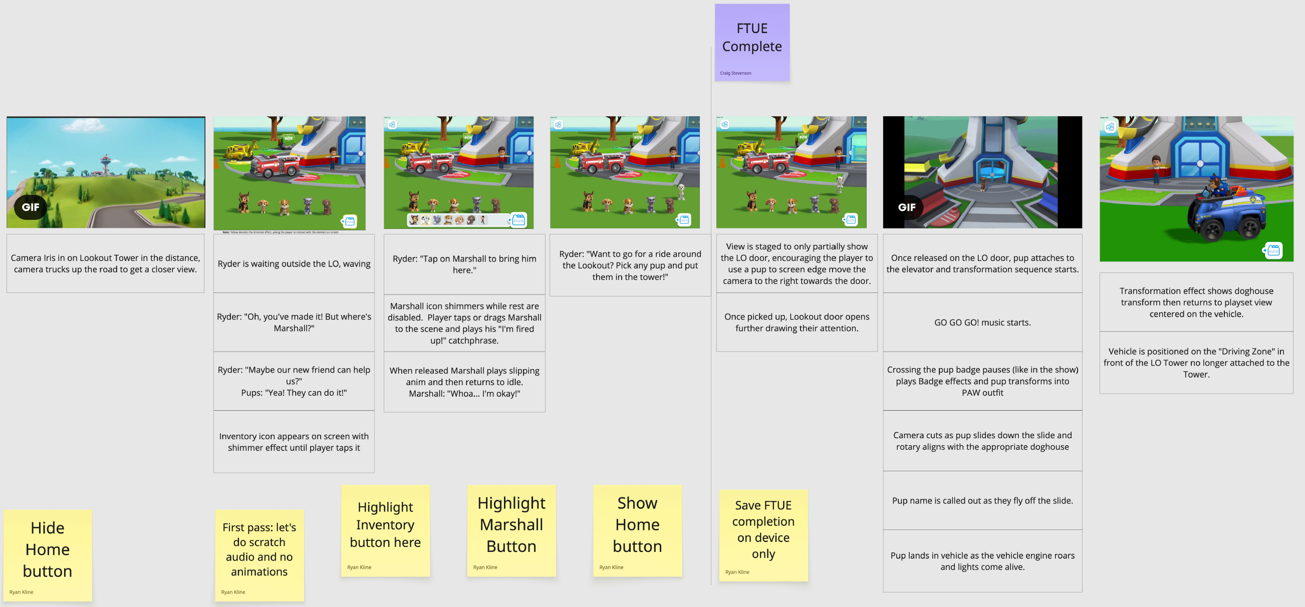
The original Miro board: each panel blocks out a beat of the flow, with sticky notes marking open production questions (scratch audio for the first pass, where to highlight the inventory button, when to show or hide the Home button).
A few process decisions from that planning stage are worth calling out because they show the same "audio and motion only" constraint solved in different ways:
- Progressive tutorialization. The inventory icon isn't just labeled or highlighted once. The flow uses a focus reticle that appears over the icon and visibly shrinks down onto it, drawing visual attention to the one interactive element on screen. If the player doesn't tap within a few seconds, Ryder's voice-over steps in with a spoken nudge, so the visual cue and the audio cue work as layered fallbacks rather than a single silent hint.
- Guided, then trusted. The two pup-selection moments in this flow use deliberately different levels of constraint. Bringing Marshall back is tightly guided: his icon is the only interactive one on screen, every other pup is visibly disabled, so there's exactly one correct tap. By contrast, when it's time to put a pup in the elevator for the vehicle ride, there's no highlighting and no re-engagement of the inventory at all, every pup is already visible in the row, and the player simply picks one up and drags it in. Having taught the core interaction once under tight constraints, the design pulls back and trusts the player to apply it freely.
- Camera staging as a cue. Rather than an arrow or pointer, the camera is deliberately framed to only partially reveal the Lookout's door, an intentionally incomplete view that pulls the player's eye (and, mechanically, their drag input) toward it. The door then opens further once they engage, reinforcing that they did the right thing.
- First pass used scratch audio and no animation. The earliest build of this sequence in Unity was intentionally rough, placeholder voice lines, no motion, to validate the beat structure and pacing before investing in final art and animation. Polish came after the sequence itself was proven out.
Final Design
The rebuilt flow covers: the main menu with the Lookout now optional rather than forced, Ryder's VO introducing the vehicle-driving activity, the reticle-guided inventory tutorial, Marshall's return, the pup-selection and elevator/transformation cinematic, and free driving once control returns to the player.
Click through the interactive prototype below, it's the same flow you'd get from Present mode in Figma, built with real component variants and Smart Animate transitions, not a static mockup.
Note: the text captions visible in the screens and prototype below (Ryder's lines, Marshall's "Hey, I'm down here") are a stand-in for voice-over, added so the flow reads clearly outside the game. They don't appear on screen in the shipped product, the target audience can't read them, everything shown here is conveyed through audio, character animation, and staging instead.
For comparison, here's how this flow plays in the shipped game:
Outcome & Impact
- Soft launch (Mexico, Australia, Sept/Oct 2025): FTUE completion reached 97% against a 60% target. This was the design's first real-world validation.
- Global launch (since July 7, 2026): across 49,320 FTUE starts, 46,715 completions, a 94.7% completion rate at full global scale, holding consistent with the soft-launch result well beyond the original two test markets.
- A/B test on the discoverability fix: ahead of global launch, we ran an A/B test comparing the main-menu-first flow against the original forced-Lookout entry. The cohort without the forced Lookout FTUE saw a 6.5% increase in D1 retention, a 3% increase at D3, and a 2.8% increase at D7, direct evidence that the discoverability fix drove more than just a completion-rate improvement.
- Downstream signal on the discoverability fix: the Lookout still sits at 89.1% reach among active users with an average of 4.9 opens per user, the most-used content in the game. Routing players through the main menu first, rather than funneling everyone into a single playset, didn't cost the Lookout any of its reach; it confirms the menu-first structure works as intended while still letting the rest of the product's activities get discovered.
Lessons Learned
The biggest lesson from this project was learning just how differently a 2-5 year old interacts with a touchscreen compared to what our original single-tap assumptions expected. The double-tap exit fix is the clearest example: adding friction is usually treated as a UX mistake, but for this audience, an extra tap was exactly the right amount of resistance to prevent an accidental exit that a single tap couldn't reliably guard against. Designing for young children means testing input behavior directly with the actual audience rather than assuming it behaves like a scaled-down version of adult interaction.
“I learned just how differently a preschooler interacts”
The double loading screens were a known rough edge we didn't solve. Load time was short on most devices, a few seconds, and a real fix (streaming or background loading) wasn't feasible in our timeline. It's the one piece of this flow I'd still like to revisit: interrupting a 2-5 year old's attention twice in the first minute is a real cost even at a few seconds each.